In the hyper-competitive landscape of modern publishing, the book cover serves as the primary interface between a complex literary work and an increasingly distracted consumer. According to recent design reporting, the month of April showcased a shift toward bold, conceptual approaches that favor artistic risk over traditional genre signifiers. From the tactile materiality of physical hardcovers to the strategic use of surrealist collage, the latest crop of designs suggests that publishers are increasingly viewing the dust jacket as an essential component of the reader's intellectual experience rather than a mere billboard for sales.
This evolution in design comes at a moment when digital discovery often precedes physical browsing. As readers encounter books through social media feeds and online storefronts, the 'thumbnailability' of a design—its ability to communicate a narrative's essence in a small, high-contrast format—has become paramount. The following analysis examines how contemporary designers are balancing these commercial pressures with a renewed commitment to visual storytelling, proving that the art of the book cover remains a vibrant, if technically demanding, discipline.
The Rise of Tactile and Conceptual Minimalism
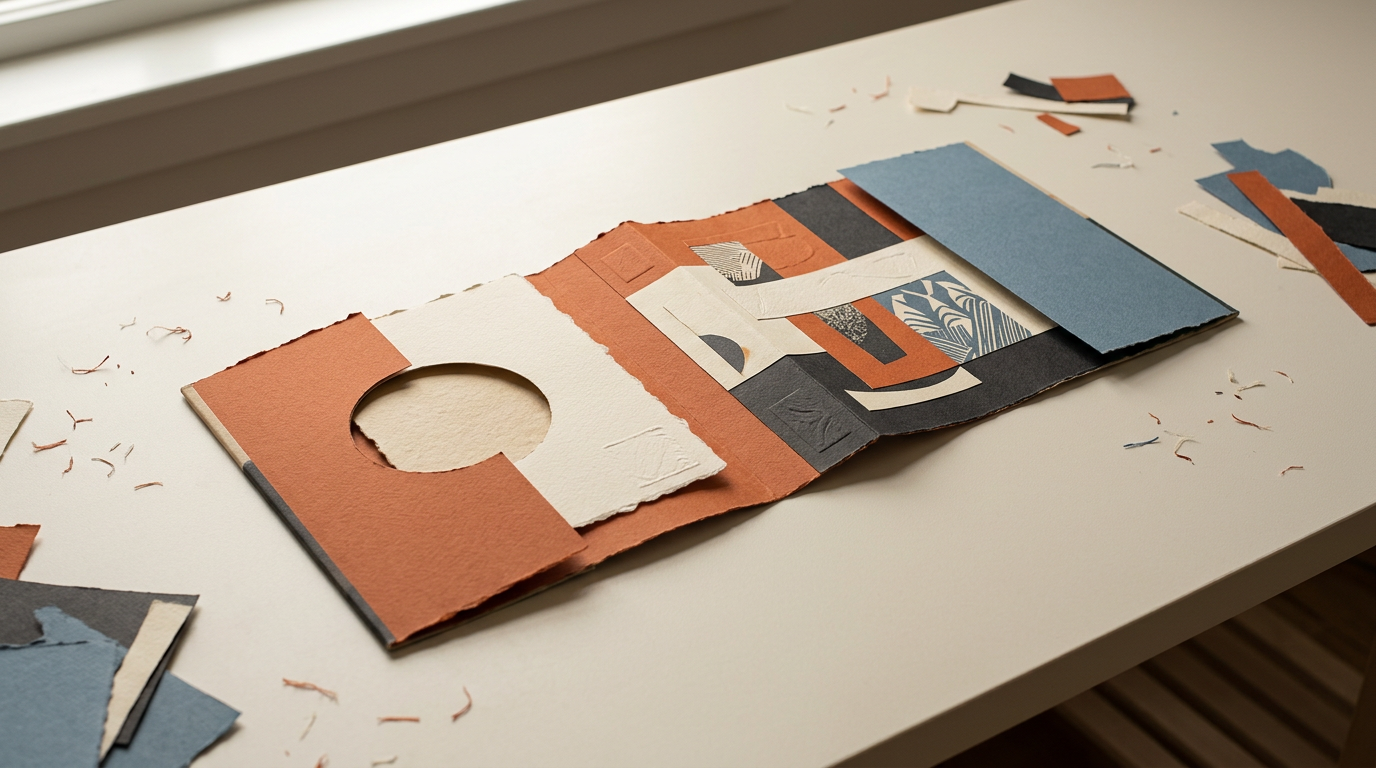
One of the most notable trends in recent months is the move toward materiality that demands physical interaction. Designers are increasingly experimenting with textures and finishes that cannot be fully appreciated through a screen, effectively creating a 'physicality premium' for the hardcover format. By prioritizing specific paper stocks, embossings, or unusual color palettes—such as the deliberate use of monochromatic orange schemes—designers are creating objects that function as art pieces. This shift is a direct response to the saturation of digital content, where the tactile qualities of a physical book offer a unique selling proposition that e-books and audiobooks struggle to replicate.
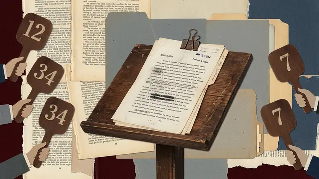
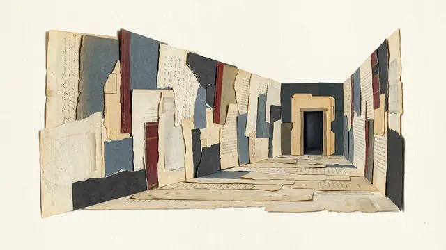
Furthermore, the use of conceptual, often abstract imagery represents a departure from the literalism that dominated mass-market publishing for decades. By employing techniques like deconstruction and surrealist juxtaposition, designers are inviting the reader to engage in a form of visual decoding before they even open the book. This approach assumes a higher level of literacy from the audience, shifting the goal from immediate clarity to intellectual intrigue. It is a sophisticated strategy that aligns the visual identity of the book with the complexity of the prose inside, bridging the gap between high-concept literary fiction and mass-market appeal.
Typography as Narrative Architecture
Beyond imagery, typography has re-emerged as a primary design driver. The integration of text into the frame of the image is no longer merely functional; it is now a structural element that dictates the flow of the reader's eye. We are seeing a move away from the standardized font pairings that have long characterized mainstream fiction, replaced by bespoke lettering and experimental layouts that mirror the themes of the books themselves. This trend reflects a broader design ethos where the distinction between the book's title and its visual context is intentionally blurred.
This mechanism of 'visual doubling'—using repeated motifs or overlapping forms—serves to heighten the psychological tension inherent in many of the season's narratives. By manipulating the frame, designers are able to suggest layers of meaning, often creating a sense of unease or curiosity that pulls the potential reader toward the object. In an era where attention spans are fragmented, these design choices act as a silent invitation to pause. The success of these covers lies in their ability to synthesize complex narrative themes into a single, cohesive visual statement that feels both immediate and enduring.
Implications for Stakeholders and the Market
For publishers, the shift toward higher-end, art-forward design represents a significant investment in brand equity. While these designs may carry higher production costs—particularly those involving specialized printing techniques—the long-term impact on discoverability and shelf-presence is considerable. In a crowded marketplace, a cover that stands out as a unique aesthetic object is more likely to be featured in editorial roundups, social media showcases, and bookstore displays, effectively subsidizing its own marketing costs through organic engagement.
For the designers, this environment offers a rare opportunity to push the boundaries of their craft, though it also places them under increased pressure to deliver 'viral' aesthetics. The tension here lies in the balance between longevity and trend-chasing. While some designs may successfully capture a contemporary zeitgeist, there is the risk that overly specialized or abstract covers might alienate segments of the market that rely on traditional genre cues. The challenge, therefore, is to innovate without sacrificing the essential clarity required to reach a broad, diverse readership across different retail channels.
The Outlook for Editorial Design
As we look ahead, the question remains whether this move toward conceptual and tactile design is a sustainable trend or a reaction to the current economic conditions of the publishing industry. As production costs rise, publishers may face pressure to standardize designs once again to ensure consistent performance. However, the current success of these more experimental covers suggests that readers are increasingly seeking out books that function as aesthetic markers of identity, which may protect these design-heavy approaches from being discarded in favor of cheaper alternatives.
Moving forward, the integration of digital tools in the design process—ranging from AI-assisted imagery to advanced digital printing—will likely continue to reshape how covers are conceived and executed. Whether these technological advancements will enhance or dilute the artistic integrity of the craft is a matter of ongoing debate. As the industry continues to evolve, the tension between the commercial necessity of the book cover and its role as a vessel for artistic expression remains the defining dynamic of the field.
The visual evolution of the book cover reflects a broader transition in how we consume and curate information. As design trends continue to shift in response to both digital disruption and a renewed appreciation for physical media, the role of the designer as a visual translator of literature becomes ever more vital. The question of how to balance the commercial imperative with the artistic impulse remains a constant, open-ended challenge for the industry.
With reporting from Lit Hub
Source · Lit Hub